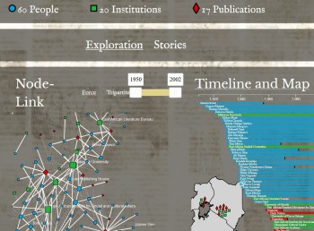
As part of our engagement with digital humanities, the 'Another World?' project produced a data visualisation, mapping relationships between a select group of people, institutions and publications at the heart of the East African intellectual and cultural scene during the post-independence era. The visualisation is a result of some of our research over the course of the project, but equally serves as an Open Access research and teaching tool, to be used in tandem with the biographies and teaching resource in this section.
The conception and design of the data visualisation was led by Anna Adima, with input from the project team. Coding and technical execution was carried out by Alexis Pister, who has made the code open source.
Explore the visualisation by clicking on this link or the image below! https://alexispister.github.io/AfricanNetworks/